Analyzing and Visualizing Data with Excel: 3 | Creating an Excel Data Model Using Queries: Importing Data from a CSV File

by Dany Hoter

Hello, welcome back. This is module three from the course about analyzing and visualizing data in Excel. In this module I will introduce you to queries in Excel that are done using a technology that was previous to 2016, which I’m using, was known as Power Query.

If you’re using Excel 2013, or even Excel 2010, you’ll be able to follow it and see the functionality that I am going to use here.

You’ll see it as functionality of the Power Query add-in in Excel.

In 2016 what we did is include all this functionality in Excel, and now there is no add-in anymore. There’s no Power Query add-in.

So you’ll see that the same functionality is now folded into the regular ribbons of Excel. And it’s there side by side with older functionality to import data in Excel.

Further down in the next versions of Excel we plan to make this technology that came from Power Query, it is now not called Power Query any more, the default technology to import data. But for now it’s there side by side and I’m gonna use it exclusively to bring data into Excel.

My first example in bringing data from using the query will be very simple.

I will just be importing a single flat CSV file, and make it into my model. This table has everything I need, not necessarily ready in the shape and the form that I need it but I will form it and shape it using the query.

So let’s start.

We switch to Excel.

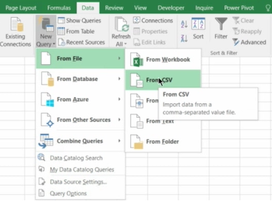
In the data ribbon, there at top in the ribbon, you see there’s an area here what we call a chunk that the title is Get and Transform.

This is where you are looking what was previously, or is still in 2013, known as the Power Query functionality. And most of it is under here, the new query.

Here, you start your queries. Power Query is a technology that is designed to bring the data into Excel.

It can bring data into the Excel grid as tables, and you could then use them for any use that you want in Excel. Or it can bring data directly into the Excel data model that was introduced in the previous part of this course. And it can actually bring data to both, which I would not recommend you to do, but if you want to it’s possible.

Importing Data from a CSV File - 0.png

Now, first thing I need to do is to pick the source that I want to use.

What kind of source is it? It’s a file.

What file is it? It’s a CSV file.

So I would say I want to query, to create a new query from CSV file.

Now, I’m gonna browse for the file.

The file is here and it’s called onetable.csv and I just double click. And now what I will see next is the query editor, so this is a environment in which I am going to enhance the query, create the query and then I can save the query, and every time I need I can write it again to refresh the data to bring the data from the same source again.

So here I see the data.

Looks pretty good to me.

But there’s still a few things which I need to do in order to prepare this data.

So first of all there are some columns which I don’t need.

So let’s say I don’t need the district, so I can just go right-click and remove it. This one here, maybe also I don’t want it. I can also go and remove it.

So I can decide which columns do I want to leave as they are or otherwise others that I can remove.

Let’s watch now the column named city.

You see that this formative as a city colon comma three. State comma the country which is USA for everyone. I also have a separate columns for the state and for the country.

So, actually, I don’t need all this superfluous data. I don’t need it both in the city and in the other column, so I would like to actually, leave here just the city.

So, what I can do, I can select this column and then I use, from the ribbon this tool, from the transformations available for me, I will use split columns.

So I say yes, I want to split it be using the delimiter, the delimiter is a comma.

Importing Data from a CSV File - 1.png

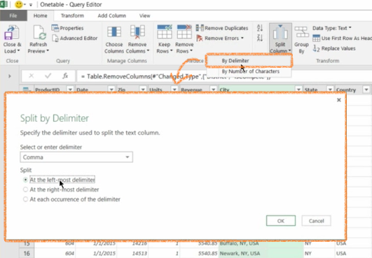
I want just to use it once, so I say the left most delimiter, click OK. And the result is that actually now I have two columns. Column 1 called City.1 and Column 2 called City.2.

City.2 is the one I don’t need, so I will remove it.

City.1, I can double-click the header and just rename it to be just City.

So I’m doing a simple a series of simple steps to make this data ready for its purpose to be used later as the basis for my pivot tables, so far nothing really fancy.

Now another thing is that the state, I actually only have data from two states here, New York and Texas, but the state comes as abbreviation. And I want this column to have the full name of the state. So I can do right-click and say Replace Values.

Importing Data from a CSV File - 2.png

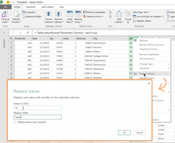
And I can do something do very simple, I say, when it’s TX, I want it to show Texas.

And here it goes.

And again, I will say Replace Values when it says NY, I want it to say New York. My mistake there, all right.

Now this looks like very manual work, I’m just going to replace.

But the good thing is if you look at the right side here, you see here the query settings here, one is that name of the query.

And I can change this to be, let’s say, I don’t know, SavesData. Because this name here will become eventually the name of the table in the model once I import it.

So I want to give it a nicer name than just OneTable. And then below that I have a list of applied steps.

This is actually each one of them is one of the steps that I did while I working on this data.

So I removed columns and each time I click on one of them, I actually see the way the data looks after the step.

So I can go and retrace me step and see exactly where I was and how did it look.

This series of steps is actually creating some kind of a script that will be saved as part of the query.

Next time, I will run the query by clicking refresh on the table that I will create.

This series of steps will be repeated, starting from the source from exactly the location of the source when I picked it up, and going forward with all the steps.

And this is why I’m not really worried about manual steps and repeating them because I do it once and then they will be repeated again and again for me.

So here we saw a list of very simple steps, later on we’re gonna see there’s a few more parts about using queries.

And we’re gonna see more sophisticated steps they can apply.

Now I’m done with preparing the data. It looks ready to me, so it can go and from here I have Close and Load or Close and Load To.

Close and Load To enables me to choose the target for this data when it’s gonna be and there’s two parts to it.

Importing Data from a CSV File - 3

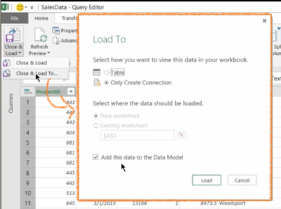
One is, do I want to see it in the workbook itself? So do I want it to create a table for me or I only want it as a connection that then can be used for refresh and so on? So in this case I leave it as the default for me here, Only Create Connection.

The second part is about this checkbox, do I want it in the data model (add this data to the data model)?

The fact the default comes this way is because I configured before. I can configure it this will be different for me. Because this is the way usually I do it. But anyhow, you see here the two parts and now I don’t need to change anything, I can click Load.

And on the right side you see the progress of this query and it says that they have 33,000 and something loaded. When I hover over it I see a preview of the data and we don’t see any of the data because it’s actually in the data model, this is where I asked it to go to the data model.

But I can go in here, insert a pivot table, again the default for 2016 is use this workbook from the data model.

If you are on previous version, I would recommend it’s much easier to go to the Powerpivot add-in and create the pivot table from there. You can do it from Excel but it will take you about eight clicks instead of one.

And now you see on the right side that actually the field is for the pivot. It has only one table with everything in it because [INAUDIBLE].

And you see here that I have the revenue which I can click on. I have the countries. Country is not very useful because it’s all from one country so, I take it out. State, within State, the City.

So I’m having pivot off all the cities. And I can actually go and create a pivot based on this data.

So that will conclude this part, in which we saw the first example of using a query.

Previously known as Power Query in Excel 2016 to bring flat CSV file.

Applying some steps to it and bringing into the model and then creating a pivot table from it.

In the next modules we’ll see building of more complex data models also using queries. And then eventually we’ll also go dive into Docs and create more sophisticated logic within these data models. So bye for now and see you in the next one.

Assessment:

  1. Which city in Texas has the most total sales (highest revenue)?
  2. What three data pre-processing steps can be done in the Query Editor?
  3. Which district has the most total sales (highest revenue)?
  4. Which three file formats are valid input for queries From File?
  5. Using the Replace Values step, how many distinct values can be replaced at a time?
  6. Where are data pre-processing steps recorded in the Query Editor?
  7. Given what you discovered in Question 3, does the same pattern hold true in each of the individual districts?
  8. Which city in New York has the least total sales (lowest revenue)?
  9. What are two ways of loading data into Excel by using queries in Excel 2016?
  10. How many cities in the State of New York have sales (Revenue)? (Hint: Distinct Count aggregation might be useful)
  11. Which district has the least total sales (lowest revenue)?

MVA Course

Analyzing and Visualizing Data with Excel: 2 | The Excel Data Model and Basic DAX: Basic DAX

by Dany Hoter

Hello, this is part two of module two and in the previous part we have seen the content of the Excel Data model.

What’s in it, and that it’s made of tables and relationships.

If you haven’t watched it yet, I would recommend going back and watching it. Because everything that we gonna do in this part is based on what we just started to do in the previous video.

So, we finished by having a pivot table populated from the data model. We’ve seen that the data, the field that’s here on the right side, contained multiple tables and I was able to drag things from each one of the tables, and to create my first pivot.

One more thing I want to show you here, before we dive into the data module using the Power Pivot add in, is, I dragged, and by default because I dragged something which is numeric, the revenue.

It created a value of sum of revenue which is the same behavior as Excel would do with native pivot table from green data.

But there’s, for example, there’s things which are possible here which are not possible with a regular native pivot table.

So, for example, if I drag the customer key to the values area, by default it will do something that is not really very useful, which is the sum of customer key, but I can go and change it to use another aggregation.

And, if you see the bottom one the very last one of the aggregations is very very important.

This is the Distinct Count. Distinct Count, so now, what I see is for each combination of country and category of products, I see the number of customers that actually have purchased this combination, the bike in a country, unique customers.

Basic DAX - 0

In the same way, I can drag now a product and show you how many different products were bought in a combination and so on. And this is something that is impossible to really do with a regular pivot and in general in many other tools is very, very difficult to do. And you can see that, with the same speed I can immediately calculate these results for any combination of slicers and so on.

So, after we saw these two, let’s go back to the window that we saw on the previous model.

The window into the data model, the manage, and in here continue to do a few more things.

So, first of all, if you notice the revenue that I use was not really formatted nicely. I can, for each one of the columns, I can apply a format. I can go, for example, and say that this is currency. So, from now on every time I use this column, it will be formatted appropriately as a currency.

But what I want to do now, is I want to create something. In the previous video, we created two calculated columns.

Now, the syntax for these columns, maybe you wonder, what is the syntax?

It looks very much like Excel.

Is it really just an Excel formula? Actually, it’s not.

This expression, which is a very simple one, but still, is written in language called DAX, D-A-X. And DAX was created together with the data model. And it starts by being really very simple but it goes way, way beyond that and into some very sophisticated options for calculations.

Now, DAX can be used in Excel in the data model in two different positions.

One is for calculated columns and one is for measures.

Measures are, there are multiple ways to do them.

One way is to use this area here below the rows in order to create the measures.

So, let me start creating some simple measures and show you, for example.

If I want to create a measure for the total revenue, I will call it totrev. And the syntax is name:=. And now we start to create an expression. Sum of revenue and I complete it with tab. Close parentheses.

Basic DAX - 1

And I have the results here, and I can also go and format it, let’s say, to be a currency.

This is my first example of creating a, what is called, implicit, sorry, an explicit measure.

Actually, I created already measures behind the scenes, if you go for a moment back to the pivot.

When I dragged anything to the values area, it actually was creating for me a measure, behind the scenes. This is called an implicit measure.

But, what I just did was to replace this implicit functionality by explicitly creating measures.

So, this one is not more sophisticated than the other that I was creating by dragging, but there are reasons even, too, for this kind of simple example, to create explicit measures and it’s a good practice to use them exclusively.

Now, I can also create another one. For example, for the total cost. And I will say totcost, sum of, and this is sum of the cost column in.

Basic DAX - 2

And again, format it as currency.

Now I will create a third measure which is a little bit more sophisticated. And this one will be calculating the margin percent.

So once I have the revenue and the cost, I can calculate the margin percent. So margin percent:=, and here I will say open parenthesis revenue minus cost divided by cost.

Basic DAX - 3

So I’m not referring to columns in the table, but instead I’m referring to other calculated measures that are already created.

I will format this as a percent.

And going back to my pivot, I will take out the two. I still haven’t replaced it, so for now I can leave it or I can take it out.

But, I want just to show you that now, when I go back to the list of columns in this table, the main table, I see the totrev. I can click on it, the totcost and the margin which is a percent. And, I can still, of course, filter, slice it by year and calculate it every time.

Basic DAX - 4

Now let’s stop here for a moment, and actually understand what has happened when I created this measure.

I created this measure once in here. And I just said that this is the sum of, so this is like the margin, but this is one this is the sum of the column revenue.

Although I defined it once, every time I see its use it gives me a different number. And the reason it’s giving me a different number is that it’s being calculated fresh every time with a different context.

And the contents, like in this cell here is Australia bikes in 2006.

So, this is the sum of revenue and this is the sum of cost.

And this is the margin for this combination of Australia, bikes and the year 2006.

If I go here, this would be another calculation. Again, every time it’s another calculation. If I go to the grand total, again it’s a calculation of this measure.

It’s not a sum of this column here, it’s actually a new fresh calculation with a new context.

So, this is a very, very important principle for the DAX language that we’re going to see, and I will repeat a few times for you to grasp the importance of, that every measure is calculated with a context.

And the context, by default, comes from if it’s used in the pivot, there’s something on columns, something on rows, some slicers, a filter maybe for the pivot and so on. So all this gives a context in which the calculation is calculated.

So this is for measures.

Now, what about, let’s switch back for a moment to understand more about the calculated columns.

Do they also have the same filter contents?

Well, actually they don’t. They have a different context.

When I calculate this calculated column, it doesn’t see the pivot that will eventually be used or built from that. It actually sees the row that it lives in. And you can use any other column in this row of data.

So, in this case, it’s used the other quantity and the list price. It could also use columns in other tables, like an extended row. And why is that?

It is because of the relationships. The relationships make other columns to be kind of related to this one.

So for example, for each row here, I have the product key. So every property of the product, I can use here, or I have the customer key. So, because of the relationship with customers, I can use data from the customers in here if I need to.

Let me give you one example to create such a calculated column that is using the context which is called the row context to, let’s go, and for example into the product table.

And in the product table I have this data and I want, let’s say that you saw that I have product category table and product sub category table.

But those two tables are actually used just for one column each.

The DimProduct category has the category name and the subcategory has the subcategory name.

I may have a goal to reduce the number of tables that my user sees when he creates a pivot table.

In order to do that, I can actually create a column here, in the products table that will have the category name, for example.

So, in order to do that I create a new column.

And I use a DAX function called related. Related means I’m gonna use a column from another table but that is related to this one. And, immediately it gives me the list of options of things which are related to where I am. And the first one is what I want. I want a category name.

So give me the category name for this product. So it goes, and it brings the necessary data from the other.

Now it seems as if it didn’t bring anything, but actually it did, because there are some products in the beginning that did not have the right connection to subcategories and so on.

So, it seems empty but it’s not. And I can call it category.

So now I have a category column in the product table. And this will also enable me, so I have here, see the list of bikes, clothing, components, and some products which will actually have a blank for the name of the category.

So, once I have this, I can actually say that I don’t need the product category. I can go here, right-click and say just hide it. I don’t delete it, but I hide it.

So, when I go back to my pivot table, I will see that the product category table have disappeared.

And if I opened a dim product table, I will see that it has now a new column that wasn’t there that is called a category.

And I can use this instead of the original one that came from the category table.

So I reduce the number of tables and I added a calculated column from a related table.

So this ends the second part of this module.

We’ve seen the data model. We’ve seen relationships. We’ve started to see calculated measures using DAX. And we saw the use of calculated columns.

The measures are calculated within a filter context, while the calculated columns are calculated within a row context.

We’re going to use a lot more of the measures, not so much calculated columns, in subsequent modules.

I hope to see you there.

Quiz:

  1. Which summary function in a pivot table is available only when you use the Excel data model?

Further Readings:

  1. Learn Basic DAX in 30 Minutes

Assessment:

  1. In Excel 2016, which two options below will you find the Manage Data Model icon in order to access the Excel data model? (Hint: for those of you who don’t have Excel 2016, Dany clearly demonstrates both options within the first couple of minutes of the video).
  2. Which statement describes an explicit measure?
  3. In the Diagram view of the Excel data model, what does a line between two tables represent?
  4. Which version of Excel was the Excel Data Model FIRST introduced??
  5. What does the RELATED function DAX return?
  6. In which two locations can you use Data Analysis Expression (DAX)?
  7. When you create a calculated column on a table in the Excel data model, which two sources of data can the calculated column be based on?
  8. Answer the following questions by reviewing the Excel data model. How many tables were loaded into the data model?
  9. Which two types of relationships are supported in the Excel data model?
  10. Answer the following questions by reviewing the Excel data model.How many rows were loaded into the FactInternetSales table?
  11. What is the total margin % of all products throughout the years?
  12. What are measures in Excel?
  13. Which statement describes an implicit measure?

MVA courses

Analyzing and Visualizing Data with Excel: 2 | The Excel Data Model and Basic DAX: The Excel Data Model

by Dany Hoter

Hello. Welcome back.

This is module two in the course for Excel, analyze and visualize data. And in this module, I will introduce you to something really important which is the Excel data module.

The Excel data model was actually initially in Excel 2010 was introduced together with an add in to Excel called Power Pivot that you probably have heard about. It has the data model in it and the next version of Excel 2013, the model was actually absorbed into Excel and now it’s part of Excel itself.

Although it has still its role and we are going to see it.

Going forward the Excel model will take a more and more important part in everything to do with data in Excel.

So we’ll look into a model that I prepared.

In this module, we’re not going to see exactly how did I build the model, but this will come in subsequent modules.

So, let’s dive into it and see this example.

When you switch to Excel, what you see is actually an Excel that looks empty. There is nothing in the green, there’s only one sheet, and everything is empty.

But, it’s not really empty, because the data is already here. And, to see the data, I can either, from the data ribbon, click on manage data model, this is new for 2016, you won’t see it in previous versions, or, from the ribbon for the part pivot you can also switch to the manage window. And this is an independent window that’s managed that is used to see what’s in the data model.

The Excel Data Model - 0

The Excel Data Model - 1

Data model, as you can see, is made of a series of tables. Each one of them is a table. It looks a little bit as if it’s Excel in the grid but it’s not. There’s no formulas just in the rows. Every row has the same data type, has a name and there’s no exceptions, it’s a little bit like tables in Excel but more strict.

And now tables can have as I said in this case the largest table only has about 60,000 rows but we’ll see later models with like two million rows.

We can watch this way as tables.

I can switch to another view by clicking here. In the diagram view in the ribbon and I will just make it a little bit smaller so all the tables will fit and here you’ll see like a dialogue, diagram of all the tables and this line is connecting them which represent relations.

The Excel Data Model - 3

Which are very important. The relationships between tables. This may look a little bit familiar to you if you’ve ever used Access. Now, so you see the tables and we see the lines which as they said represents relationships. Every relationship has a direction, goes from one table that’s in here. It says one. And the other table it says. This represents the fact that these relationships are one to many relationships.

So for example, this FactInternetSales, which is the main table in this model that contains the actual sales transactions has many rows.

For each row in the DimProduct, which contains a row for each product.

So one product, many rows in the FactInternetSales table. The same with customers, many rows in the sales, many transactions the customers have purchased multiple times so it will have multiple rows in the Internet sales and one row representing this customer in the customer table.

In this example there’s a table called DimGeography which actually represents cities. So a customer lives in a city, city has many customers. So there’s a one to many relationship between customers and the city in the DimGeography. So the same table them customers play the role of one against the five Internet sales and the role of a many against the DimGeography.

And relationships are what make this model behave as one.

I can use this model to, people in Excel can use this model.

As one, as if it was one table and we will see it in a moment.

Let’s switch back to the data view and look at the content of the fact internet sales.

So, this table has some information about the product that was purchased, the order, date, the customer, the quantity, the list price and the product cost for each unit of product that was purchased.

In order to do some analysis, I obviously missed something here. I missed the actual revenue for this line, which is the order quantity times the list price.

So, actually I can add calculated columns to this table that use other columns in the table. So, I just go to an empty column and I start typing an expression in a very similar way to what I would do in Excel.

I click Equals, and I click on the order quantity, asterisk or times list price, enter. Now this will be now calculated for each row in the table.

And now I can also go and give it a proper name. Let’s say it’s revenue. So, now we have the revenue calculated.

And, if I want the cost, I will also go and create myself a cost. And I will say all the quantity times product cost, and again, I will have a calculated column.

So, by having these calculated columns, I have completed the data that I need in this table and I can switch back to Excel, I will just, go back to Excel and in Excel I will say insert pivot table.

The Excel Data Model - 4

This dialog is a little bit different in Excel 2016 than it was in previous versions because I have this very important button that says use this workbook’s data model.

So the default for Excel to create a pivot table, or a pivot chart, if there is already a model in this file, is to use the data model as a basis for the pivot.

So I click end, okay.

And now I have my pivot. Now if you look on the right side, you’ll see that. This is not very, like, it’s not like any other pivot that you’ve seen before because it’s contained of the many tables that were in this model.

In which one there are multiple columns, I can open it and they start dragging and using column for any one of this tables.

For example I have the revenue, I can click it, drag it to the various area. And I see the value coming here. If I want to take let’s say the country. Put it on rows and I go to another table here, which is about product categories and I take the product category and write it to and now we have a full and also I can create in the same way, I can create from, let’s say from the year I want to create a slicer.

So I do create the slicer, and the slicer is now connected to the pivot and it’s able to slice the pivot.

So I had my modern with many tables with the relationship.

The fact that I’m clicking here and I’m filtering on a year, because the year is coming from a table called date, and this table is connected or related to the main table, it means that when I’m clicking here it actually applies the filter to the main table and I see only rows that correspond to the year 2006 in the same way that this number here, for Australia bikes, show just data, the sum of data, for Australia and bikes.

So I will close here, this part, and we’ll continue in the next video, actually it will be a direct continuation of where we stopped, and I will show you a little bit more of the options and what can I do with this model.

So see you on the next part of this module.

Quiz:

  1. In which version was the Excel data model introduced?

Further Readings:

  1. Table Relationships in an Excel Data Model
  2. Calculated Columns
  3. Calculated Fields / Measures

MVA courses

Analyzing and Visualizing Data with Excel: 1 | Data Analysis in Excel

by Dany Hoter

Hello everyone my name is Dany Hoter and I’m a Senior Program Manager in the Excel team in Microsoft. And this course is going to be about analyzing and visualizing data in Excel.

Actually I’m gonna use Excel 2016. Originally it was supposed to be with Excel 2016, but we decided to just call it with Excel. Because you’ll be able to follow this not only with Excel 2016 but also with Excel 2013 and with a little bit more difficulty also with Excel 2010. Now, I’m gonna be covering areas of importing data into Excel, creating models of data in Excel and using new tools that were added to Excel in the last versions.

Let’s go straight into our first module.

And in this module, actually I’m going to show you things which are not necessarily new. I’m gonna show you data analysis using data in Excel, in the grid of Excel. And most of you will be, hopefully familiar to you but I’m going to cover it and then show the differences between this classic way of analyzing data and the new tools that I’m going to show you in for the modules.

So let me open my first file here in Excel and let’s understand how people are doing data
on Azure and Excel for years.

All right so what do you see here is at least my take on a classic there’s Excel, it had three pivot charts. Two slicers, right here. Three pivot charts. And the slicers are connected to all the pivot charts, so if I click here on accessories, all the three charts respond. I can select one, I can select multiple. And the data for this, what you see here is actually in the, I can hide, I can unhide some of the data here.

And you’ll see that actually all the data is right here in Excel.

The data came into Excel, let me unhide also the others cuz there are multiple tables here that contain the data. And this is kind of typical that the data is contained in a few
ranges in Excel. But the author who created this support needed to combine all the data into one consecutive range of data.

Because if people table, or people charge, like I was using here. Needs all the data to be in one range. So, the first columns here are going all the way from A to E.

The regional data that says transactions. And then, all the columns coming from F to L are columns that are actually bringing data from the other tables into this table to make it one big table. And for that, the Excel user uses one of the oldest tools in Excel, function.

So this is actually using two V lookups, this is using another V lookup. And V lookup, I will not go into the details of explaining to you how to use V lookup, because it is not really the purpose of this course to teach you about V lookup.

But just as a quick reminder, V look up provides a key to another table.

In this case, it’s the customer and then the table is the customer’s table. And then it tells you, in this case, to bring column number five and folds tells V look up expression to look for an exact match and not just not exact match.

Now it may seem a little different from V lookup you saw before if you haven’t been using tables in Excel.

In this example I’m using tables this is why it’s formatted this way and also this is why the expressions use column names and table names instead of a regular reference to Excel.

If you don’t use tables I would recommend really to look at it. They’ve been around for quite some time in Excel, since 2007, and they are a great tool.

And it makes for much more readable formulas and also easier to maintain formulas.

Now let’s go back to our dashboard.

So pretty much you see that I can get nice results. The dashboard at least to my standards, looks pretty nice.

So what’s wrong in this picture and why did we need to introduce new tools into Excel in the latest versions, to go beyond what I was able to do here?

So the challenges here are the following.

First of all this need to combine all the data together with V lookup. It has its flaws, its problems.

First of all, V lookups can get very slow.

Let me give an example here.

If for any reason I go to the customer’s table that I bring data from into the main table, the sales table, and I go here and I just change one cell, let’s say this guy.

Marital status of this customer, change from single to married. Also means that this guy married. If you notice in the bottom, in the status line it says calculating and it has a progress bar.

Going, going, going. Still going.

And only now all the calculations were actually completed.

The reason that it’s a simple operation of changing one cell took so long is because this range is used in thousands and thousands of vilcom expressions, and all of them needed to be calculated.

So, video caps can be slow. And this is slow, it can be actually a lot slower. And now video caps can also be difficult to maintain and can be error prone.

Another problem is that the data that we use is not always as simple as this one.

Here the only problem was to combine it to one range. But many times I need to do much more operations on the data to manipulate, to shape it, to make it ready to be used in analysis.

And in order to do that the Excel user had some tools, you could use manual copy and paste operations, you can create some macros if you knew how to.

You can use SQL to manipulate the data on the SQL side if you knew how to.

But none of these solutions was really easy and accessible for Excel users.

And if you did some manual operations you had to repeat them every period. Let’s say if the report is weekly, you had to repeat this every week. And this became really, really tedious, and people really did not like it. So manipulating and making the data ready to go is another thing.

The third one is scale.

The Excel grid is a maximum of a million rows and for many cases this is not enough. And even if you go to half a million and still have columns with V lookup, it would be terribly slow.

So the skill of being able to manipulate millions of rows is not something that a regular Excel user would be able to do with regular Excel like this. So in order to solve these issues and another one that I want to mention is that some data sources are not really accessible to native Excel.

So some modern Data sources let’s say if data is coming from Facebook, from Salesforce from other OData, some of them are really not accessible to Excel and people want to use a large variety of data sources.

To solve all these problems we actually since 2010 have been providing new tools to Excel to be able to first of all create people tables and people charts without needing to combine them physically into one large range.

So staying with multiple tables that you can use and create people tables directly from.
Creating, having a way to manipulate the data in very powerful ways and a repeatable way.

You do it once you check the data.

Next time you need to import the same data you just click on a button and it does everything for you.

So this is the second thing, scale.

Being able to get into Excel millions and millions of rows, even tens of millions if you need to, is another thing, and with very good performance. And the last one, which actually I haven’t mentioned as a deficiency is about creating logic, business logic.

Here, I’m using just one example, if you see here, on this chart on the right side, there is a margin percent.

It’s a dual access charge on one side, it’s showing the margin percent and the other the revenue.

The margin percent is calculated from the revenue and the cost with something called calculated field for the pivot table.

I won’t even go and show to you exactly how to do it, it’s been there in Excel for many, many years.

But using calculated fields is very limited.

The level of sophistication for the business logic you can create is very limited.

And the new tools that I’m gonna show you will make it possible for you to create really, really sophisticated business logic and do the calculations in a language that is similar to Excel, but extends the capabilities of Excel.

So this is what we are going to do in all the other modules coming from here.

I will show you the new tools, the new data modeling Excel, the new language for calculations, the new tools for querying and shaping the data.

So this is the end of this module and you should expect in the next modules to learn about this new tools that are available now for doing data analysis and visualization in Excel.

Thank you and see you next time.

Quiz:
1. Which two functions you can use to achieve the same result as VLOOKUP? (Select two answers.)

Further Readings:

  1. VLOOKUP function
  2. Excel Tables
  3. Slicers

Assessment:

  1. You can use VLOOKUP to combine data into one range. What are the challenges of creating pivot tables based on this range?
  2. Which two actions unhide a worksheet in a workbook?
  3. Which two components can be connected with a slicer?
  4. Answer the following question by reviewing the data source for the dashboard objects (Hint: you may have to consider the source from formulas as well).Where does the product’s categories and segments data come from? (Select two that apply)?
  5. When using the VLOOKUP function, what is the purpose of the fourth parameter?
  6. Answer the following question by reviewing the data source for the dashboard objects. Where do the sales figures shown in the charts come from?
  7. What are three reasons to use tables in excel?

MVA courses

Top 5 C++ Questions Explained: Is the size of a struct greater than the sum of its parts?

by Adrian Leven

>> Question three, is the size of a struct equal to the sum of the sizes of the variables that are stored within it?

Let’s find out, shall we?

So you can see here that I’ve just created two structs, struct one and struct two that store a couple of very small variables.

Struct one has a one-byte character, a two-byte short and a four-byte integer. So if we just add these all up, in total we should have a struct of size seven bytes.

Next, we have struct two which contains two one-byte characters, a four-byte integer and a two-byte short. In total that should be eight bytes.

Now, let’s run our main function and see what the actual size of these two structs are.

So you can see here that we’ve printed out the sizes of our structs. And it’s not exactly what we expected. Struct one is size eight and struct two is size 12.

What exactly is going on here?

The answer is padding.

The way that compilers work and especially with C++ is that it’s much more efficient to store things within blocks of four bytes, based on the way that memory addresses work.

So when we have our one-byte character and our two-byte short, we’re not going to put our four-byte integer right at the end of that because we want to put everything into its own neat little four-byte bucket.

And that we don’t want anything overlapping.

So what’s actually happening here is that we have our one-byte character and our two-byte short.

And then we have an additional one byte of padding which makes the struct a little bit nicer to fit within this four-byte bucket structure.

Struct two is also a little bit surprising because if you think about it, surely we should be able to fit these numbers within four bytes.

We can just put our two one-byte characters next to each other and then fill in the additional two bytes of that four-byte bucket with our short and then have our integer c be the additional four bytes.

So in total, it should just be two four-byte buckets for a total of eight.

However, we saw that the actual size of struct two is 12 bytes.

And the reasoning for that is that it’s much more efficient for the compiler to instead of moving our short d up here to where it would fit in the two bytes of room that we have left, it just inserts another two bytes of padding here, and instead of moving around the short d, it inserts another two bytes of padding, giving us a total of 12 bytes.

You can see that structs will always end up with a size that is a multiple of four bytes, just because it’s a lot easier for the compiler to do the math that way.

That should clear up the discrepancy between what we think should actually be the size of our structs, and what the actual observable size is of these structs.

It all has to do with how the compiler works and the efficiency in the optimization that the compiler uses in order to make your program faster.

This isn’t super important in the current year because we don’t really have to worry about memory sizes given that we’re working with such powerful computers.

But, back in the early days of programming, these considerations were a lot more important.

So it’s an interesting piece of history to consider the size of structs and their actual observable size.

MVA courses

Data Analysis with Excel: 4 | Excel Trend Curves: Moving Average Curve

by Dr. Wayne Winston

In the last video of this course, we’re gonna learn how to use the moving average aspect of the trend curve to eliminate seasonality and smooth out variation in sales data.

We will use again the quarterly Amazon Revenue that we had used unconditional formatting in an earlier video.

So, what we have is 1995 through 2016, the revenue in millions of dollars for Amazon.com and we’ve basically labelled the quarter numbers 1 through, we have 81 quarters there.

So let’s first graph this data and you’ll see some interesting things. And we have the quarter number, fourth quarter, first quarter, of the quarter of the year, but we don’t need that for this chart.

So we’ll go insert and we’ll do our friend scatter. And now let’s do a line chart there.

Okay, so now you see 81 quarters of revenue and I think you could see there’s a periodic peak every fourth quarter, Amazon does fantastic. And so if you’re looking to try and understand the growth of Amazon those peaks sort of mess you up, so what would a moving average do in this situation?

Well a four quarter moving average would include one quarter from each quarter of the year and that would eliminate the seasonality. It also smooth out random variation.

So, people often look at quarterly data, they’ll look at a moving average, that’s four periods and if they’re looking at monthly data, they’ll look at a moving average, which is 12 months, cuz that will eliminate seasonality.

So, we can right-click here, we can add a thread line, there’s the moving average option and we’ll say four, because we have quarterly data.

Moving Average Curve - 1.png

And that should work out.

And now you can see this smooth curve here is the moving average.

You can see there’s a fairly smooth uptick in Amazon’s growth. And you see we’ve eliminated those peaks every fourth quarter by looking at the four quarter moving average.

Well that’s the last video in this course I really hope you’ve enjoyed this course and learned a lot.

Good luck to you in your future.

MVA courses

Data Analysis with Excel: 4 | Excel Trend Curves: Power Curve

by Dr. Wayne Winston

So we’ve learned how to fit a straight line to data. We’ve learned how to fit an exponential growth curve when the curve gets deeper.

What about if the curve gets flatter? In that case, we should probably try and fit the power curve.

So the equation of the power curve you can see right here is y equals a times x to the b. X is our independent variable, y our dependent variable. We don’t know a and b, but the trend curve can figure it out.

And again, whenever the curve gets flatter, we should try and fit the power curve.

Usually does a really nice job.

And the nice property of the power curve is whenever you double x, y changes by the same percentage.

Okay, so let’s do a famous example of the power curve, the learning curve.

Now the learning curve or experience curve, what do you think that means?

Well the more you make of something, the lower the unit cost or the lower the hours it takes to make the product.

Now it’s hard to find data on the internet on learning curve, so I have some old data on fax machines. Probably most of us don’t even remember what a fax machine is. But we have in years 1982 through 1989 how many fax machines were made in the US, and what the unit cost was, and you can see it’s dropping.

So if we look at cumulative production as x the number of total units we’ve made put that in the x axis, and put the unit cost on the y axis, we should be able to get a power curve. It should look like it’s getting flatter.

Okay, and then we can get what’s called the percentage of the learning curve, which means that if it’s like an 84% learning curve is we’ll see whenever we double the units made, the cost drops by 16%, 1 minus 84%, but first let’s get the cumulative production.

For the first year it’s what we’ve made so far.

For the second year it’s what we made through the last year plus the current year.

When we drag that down, we now have cumulative production.

In our last year of data, we made 1 million 744 thousand up to that point.

Now we graft this data, and you’ll see it gets flatter, and it’s dropping, but the power curves still works if we’re getting flatter and increasing.

What’ll happen is if the curve is flatter and decreasing, b will be less than zero.
If the curve is flatter and increasing, b will be between zero and one.

And if b is greater than one, the curve gets steeper, but that usually doesn’t fit that as well as exponential.

So now if I select these two columns, and I do, again, scatter not line chart, there’s the scatter chart, you can see that that is getting flatter.

Okay, so now let’s try and find the equation of this curve from the trend curve.

We pick the power curve.

You see that looks like it’s getting flatter.

Okay, now if I select those points, and I go right-click, add trend line, power curve, even though the Microsoft icon says it’s getting steeper that’s misleading us from when the curve gets flatter. So I can say display equation on char.

And we’ll make that a little bit bigger.

You can see it’s doing a pretty good job of fitting the points, and the nice thing about the power curve, it seems to extrapolate well unlike the exponential to new data.

Learning curves do a really good job.

My experience teaching people at the Navy indicates that once you have the learning curve for, let’s say, the first few planes that have been made of a model of a plane, it’ll work pretty well to predict the cost of making subsequent planes unlike exponential growth, which does not extract way it well.

So I made this bigger, okay, so you can see we have a negative exponent there, okay, minus 0.253.

So we’ll make a forecast to compare it to the actual point here, 65,259 times the cumulative production raised to the -0.253 power.

Now the way you raise to a power is you use the carrot key over the 6.

So we do 65,259 times cumulative production, carrot key over the 6 to the -0.253.

Drag that down, and there’s our forecasts. And they compare pretty well to the actual.

Now what about that learning curve percentage of the property that whenever you double, whenever you double x, y changes by the same percentage?

Well let’s take some examples of x.

So let’s suppose we go from 100,000 to 200,000, which is double 100,000 and 400,000, and I guess we could go to 800,000.

So every time we’re doubling cumulative production.

And I’ll show you the predictive cost drops the same percentage. Just copy the prediction down.

Okay, now let’s see what’s the percentage drop?

We go from 200,000, what’s the predictable loss compared to 100,000?

It’s 84%, copy it down, and you still get that 83.9%.

That’s your 84% learning curve.

Whenever you double what you make Cost drop.

The cost will be 84% of what it was, which means it dropped by 16%.

And the government and the Department of Defense, when they’re negotiating contracts with companies that sell tanks and sell planes and sell ships, they understand that the 100th plane or the 100th ship will not cost the same amount as the 50th plane or ship. Because people are learning to make it better.

In the final video in this course, we’ll talk about the moving average aspect of the trend curve.

MVA courses

Data Analysis with Excel: 4 | Excel Trend Curves: Exponential Growth and CAGRs

by Dr. Wayne Winston

So what do we do if a straight line doesn’t fit our data well?

Well if the curve gets steeper, we usually look at exponential growth, so let’s look at an example.

So here we have annual sales revenue of Cisco, Year 1 is 1990. You might wonder why I didn’t put 1990 there and I put a 1, we’ll answer that question shortly. And if we graph this revenue with this being with on the y axis and the year being on the x axis, we’ll see a straight line as really not reasonable.

So, what should we do?

Well, the answer will be exponential growth, which we’ll describe in a moment.

We do Insert, Scatter Plot like we did in our last video.

Okay, now if you think that should be a straight line, you probably need glasses, or you don’t know what a straight line is. That curve is getting steeper, and that’s a very common pattern for revenue growth for a new high-tech company.

So if a curve gets steeper, we want to fit exponential growth.

What does that mean?

It means we’re predicting y equals a constant a, times the number e 2.7182 raised to a power b times x, where x would be the year number with the first row being year 1.

Why we don’t use 1990, is you took e, which is around 3 to the 1990, it would blow up the computer. So, you have to start with year 1.

So, the question is, what values of a and b would best fit this data and the trend curve can tell us. And then the property of the exponential growth which is important to us, is whenever x goes up by 1, y always increases by the same percentage.

And that’s what’s called the CAGR or the Compound Annual Growth Rate.

In other words, whenever x goes up by 1, you’ll see in a moment, our prediction for why revenue goes up by the same percentage and that’s our best estimate of the growth rate during the time period.

Although in the future, usually the Compound Annual Growth Rate for a high-tech company will eventually drop, but let’s try and fit the exponential growth equation here.

So remember, we right-click, select the points. We do right-click, Add Trend Line, and
then we’re gonna do Exponential, and we can do Equation on Chart. The r squared is a bit misleading in this situation so I’m not gonna even show it.

So now if I make that a little bit bigger, and as I Select this I do CTRL+1 and I can say Font Size, let’s say 15.

Okay, you can see that does a pretty good job that fitting the curve except for the last point. The last point falls far short of the prediction and that often happens with exponential growth.

In this case, Year 10 was 1999 and then the tech recession started right after And you can see the exponential growth for Cisco sort of stopped, or basically decreased, and it never really came back again, which is common with high-tech companies.

Show me a company that grew for 30% or more for 30 straight years, I’ll show you a company that probably never existed.

I’ll give anybody $50 if they can email me a company that meets that criteria.

Now what would we make our prediction for each year be?

It would be 58.553 times the exp, 5.5694 times the year one.

Now I meant, we don’t want an x there, 58.553, I hit the wrong key there, and then basically that’s our prediction, just copy that down.

You see in Year 10 we predicted 17 billion, this is in millions, these sales, and Cisco only came in at 12 billion.

That would indicate they just aren’t going to ever catch up to the compound annual growth rate.

So, what was their compound and your growth rate?

Well, you take the prediction for one year, divide it by the prediction for the previous year. The prediction for the second year was this, divide it by the first year and you’ll see every year that ratio is the same.

That’s what I mean when x goes up by 1, y always see increases by the same percentage.

So 76%, 77% was the CAGR, 76.7, that meant during this wild period of internet growth, Cisco’s annual revenues grew at about 77% a year.

And you just can’t keep that up, I mean there’s no way.

If you would extrapolate this prediction to year 16, which was 2005, and just copy that formula, you would have a prediction that Cisco would be a $530 billion company.

And to be honest, that would have made them the biggest company in the world in 2005, and I think actually that prediction was made in 1999.

Cisco at one point in 1999 had the biggest market cap in the world, it used to cycle between Microsoft, GE and Cisco in 1999. And Cisco is a great company and has done well, but certainly it’s not grown at that rate.

Now in the next video we’ll show another example of, in the next video we show you another example of fitting a non-linear curve. The power curve, which is used to model data that gets flatter, either flatter increasing or flatter decreasing.

MVA courses

Data Analysis with Excel: 4 | Excel Trend Curves: Fitting a Straight Line to Data

by Dr. Wayne Winston

In this video we’ll begin our discussion of the Excel trend curve.

The Excel trend curve can be used to fit various equations to data. But what’s the first thing you should do when you want to figure out how two variables are related?

Well, you should plot them. And so you plot on the x axis the column to the left of what goes on the y axis the column to the right. Here’s some examples.

You might wanna predict monthly cost from units made. You might wanna predict the price of a home from the square feet in the home. You might wanna predict the return on a stock from the market return that month. You might wanna predict the companies total sales from ad expense. In each case you should graph the independent variable, as we call it, the x variable, put that on the x axis so it should be in the column to the left of the dependent variable which is what you wanna predict.

So let’s look at an example of how the trend curve works.

So we have 14 months of data for a company. We have the units produced. Let’s suppose the refrigerators and the monthly cost of running the plant.

There should be a relationship.

The more units that are produced, the higher the cost of running the plant.

So we wanna get some insights into the form of that relationship.

We should graph these points.

So we select the data, including the headings, and you do scatter plot. Please don’t do a line plot, the scatter plot is right here. So you do a scatter plot and we’ll just have the dots there.

Fitting a Straight Line to Data - 1.png

Okay, now if we take a look at this, it looks like a straight line should fit this data. On the x axis is units made, y axis is total cost of running the plant. It looks like there should be a straight line going right through those points.

Now we can find that with a trend curve.

We select all the points and then if we right click, you’ll see Add Trendline. And there’s a bunch of choices, which we’re not gonna do all these in our module, but we’re gonna do exponential, hour and moving average as well as linear.

Fitting a Straight Line to Data - 2.png

Logarithmic is not that big a deal, polynomial is not that important either.

But it looks like a straight line would fit the data so we click on linear which is the default. And then we could say display equation and R-squared (on chart) and then we’ll explain what we get there. So we display equation in R-squared, and we should probably make this a little bit bigger.

Fitting a Straight Line to Data - 3.png

If we would select this, I can do control 1 and I can pick a bigger font and we can see this a little better.

Okay, now you can see the line that sort of splits those points in half. That’s called the least squares line. It minimizes the sum of the squared distances at the points to the line, sort of splits the points in half.

The distance of the points above the line and below the line are equal, as we’ll see in a couple of minutes.

So it says here, your best bet at predicting the cost of running the plant is 37894 plus 64.269 times x, which is the unit’s made.

Now that 64.269 is basically your unit cost.

Every extra unit you make cost about that much money, and this is your fixed cost.

The R-squared of 0.6882, R-squared is always between 0 and 1, tells you that 69% of the variation in monthly cost, your dependent variable, is explained by variation in your units produced.

Okay, now can we put in our spreadsheet what the predicted cost would be for every month, in other words, make this prediction equation operative.

Well, we would take equal the slope 64.269 times the units made and add that 37894. More decimal points would be more accurate but we won’t worry about that. So, that’s your predictive cost.

Double click the left mouse to copy it down. Goes down a bit too far.

So, we now have a prediction, where basically each of those months, or basically what the cost of producing the number of units would be.

We have the actual cost, so what’s the error?

Actual minus predicted.

Let’s take the actual cost minus the predicted cost, and that measures how far the point is above or below the line.

So that first point’s about 4,000 units above the line Now, if I copy that down, I have the errors.

And the sum of the errors should be approximately 0. Let’s see if that’s true, cuz the line splits the points in half.

So I add up those errors at minus 2.04. Now that would be exactly 0 if I added more decimal points to this equation.

But I’m not gonna worry about that.

Okay, now, the information we got in the chart could actually be obtained from Excel functions.

There’s a slope function to get that slope, an intercept function to get that intercept, an R-squared function to get the R-squared value.

And as to the accuracy of these forecasts, there’s an s-t-e-y-x function that will show you in 95% of your predictions should be accurate with in two s-t-e-y-xes.

So let’s quickly go through those.

So now we can name these ranges of data.

It will be easier for us.

Select the data, go Formulas > Create from Selection > Name in Top Row.

So we’ve named this column Units Produced and the next column Monthly Plant cost.

So how can we recreate that slope?

Well, guess what? The function’s called slope.

So say slope and what comes first is the y range, which is Monthly Plant cost, and then what comes next is Units Produced.

Right there.

So that says what’s the slope if you predict monthly cost from units produced?

64.2687, that’s where more decimal points would help.

What’s the intercept?

That’s the constant term.

So I would go y first, Monthly Cost.

Just double click with auto complete, Units Produced, and I should duplicate that 37894, and I do.

What’s the R-squared?

The function for that is RSq. R-squared.

The y coordinate would be Monthly Cost, the y variable, and then Units Produced.

And it doesn’t matter what goes first there, x or y, R-squared will come out the same. But there’s your 68.82.

Finally, the standard error of the regression, s-t-e-y-x, and the y values are in the Monthly Cost column, monthly plant cost. And the x values are in the Units Produced column. This will come out about 13,700.

Okay, now what does that mean?

68% of our forecast should be accurate within one standard error of the regression, 95% within two standard errors.

So an outlier will be anything that’s a point where the prediction’s off by more than double that 13771 or about 27,000.

We have no errors that large so there are no outlier. Not a good or bad thing, just a fact. But we should really understand again normal variation.

Even though in this month here, the actual cost was 20,000 higher than we expected, that wasn’t an outlier.

It was normal variation.

Now what we should really do is learn from our outlier.

Months in which we did much better than average costs were much lower than average.

Than predicted, I’m sorry.

We should basically try and replicate those months. And months in which our cost was more than two standard errors above predicted, we should try and find out why that happened and make sure that never happens again.

We’ll see in the next two videos situations where fitting a straight line would not make sense.

So in our next video we’ll look at exponential growth, which is what you should use to fit a curve usually when the curve gets steeper.

MVA courses

Data Analysis with Excel: 3 | Conditional Formatting: Conditional Formatting with Formulas Part II

by Dr. Wayne Winston

And our final video on conditional formatting, let’s show you another example of the formula option.

So in the file storestemp, what we’ve got here is a five months of sales for three different stores. And let’s suppose you wanna highlight the best month of sales for each store.

So for example, for store one you should highlight the 100, for store two the 50 and for store three the 75.

Now, what we wanna do is select the range we wanna format and have formula that copies down and across and whenever it’s true, the format will take hold.

Now, this is a bit tricky. What should the formula look like?

Well, the formula should say, whatever cell where in, in this case F5 is the upper left hand corner. Does it equal the maximum of it’s column? And so that would be the maximum of F5 through actually five, six, seven, nine then.

Now the key is you’ve got to dollar sign the numbers there, not the letter.

Cuz when that formula copies down, if you don’t dollar sign the five through nine, that’ll change to a six through ten, and then you wouldn’t be comparing the month of sales in that cell to the set of relevant numbers in that column.

So you have to dollar sign the five through nine.

Now you don’t wanna dollar sign the upper five here cuz you want that to change to like F6, G5, all the way through H9.

And you want the F over here to change to G and H when you copy across the column.

So if we enter this formula correctly, we should see the largest number in each column highlighted and if the numbers change, then basically we can see the format move which will be really cool.

So we do home, conditional formatting, new rule.

Again our friend use of formula.

Okay so now what where gonna say is equals F5.

Now it’s gonna show dollar signs but with the F4 key, you can move the dollar signs.

So I hit F4 until the dollar signs disappear. So I can cycle through the dollar signs tie they’re gone and that what he call the maximum of this column.

Now, again, what I wanna do there is not dollar sign the F so I can just get rid of that dollar sign.

I dollar sign the five and nine, that came through.

Okay, so I’ve got maximum of F$5:F$9.

And again, that formula as we’ve discussed we’ll copy in the right fashion and it will be true only if the number is the largest number in it’s column.

Conditional Formatting with Formulas Part II.png

So I’ll format fill, yellow shows up pretty well.

So let’s see what happens with that.

We can see the largest number in each column is highlighted in yellow and if store two made a really big sale in January and that was the biggest number, I make that an 80.

And that’s highlighted in yellow.

That concludes our discussion of conditional formatting.

In our final module, we’ll talk about the great Excel trend curve feature that lets you fit curves to data.

MVA courses